Blog
A Complete Guide to Crafting High-Conversion Calls to Action
Understanding the Power of Call to Action
Imagine if your website could play the perfect salesperson, converting casual visitors into loyal customers, convincing them to take the plunge and indulge in your products or services. That’s precisely the role of a compelling call-to-action (CTA). A persuasive CTA is memorable, profitable, and incredibly powerful. It’s a vital instrument in the digital marketing toolkit that gives your potential customers the nudge they need to go from “just looking” to making a purchase.
Components of a Successful Call to Action
A successful Call to Action (CTA) goes beyond simply using action words like ‘Shop’, ‘Order’, ‘Buy’, or ‘Save’. The real power of a CTA lies in the art of combining multiple elements. These elements work hand in hand to catch the visitor’s attention and entice them to take the next step.
Firstly, consider the copy. Your CTA should be short, direct, and compelling. Try using action-oriented phrases paired with a sense of urgency or exclusivity. For instance, ‘Shop Now and Save 20%!’ sounds more enticing than a simple ‘Shop Now’. To make it simple, you’re not just offering a product or service; you’re offering an opportunity.
Next, focus on the design. It’s not enough to have a great message if it’s going to get lost in the noise of your website. Contemplate employing contrasting colors to make your CTA stand out. Distinguishable buttons or clickable areas can also significantly grab your visitor’s attention. However, always follow your brand’s style guide to maintain a coherent identity.
Colorful CTAs are 14% more likely to be clicked.
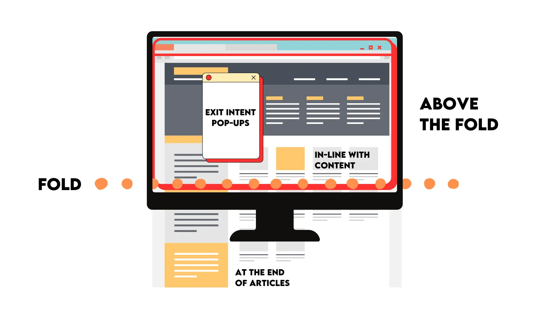
Lastly, think about placement. Your CTA must be where it’ll easily catch the eye. Whether that’s above the fold on your homepage or at the end of a particularly compelling piece of content, placement is critical in ensuring your visitors take notice.
Types of CTA’s and Where to Use Them for Maximum Impact
Crafting compelling calls to action (CTAs) can be a game-changer when it comes to guiding your audience to act. Various types of CTAs can be strategically used to maximize impact and drive conversions.
- Direct CTAs: They are clear and straightforward, leaving no room for ambiguity. Phrases like “Buy Now,” “Sign Up,” or “Subscribe” fall under this category. Direct CTAs work well on landing and product pages with the intent to prompt immediate action.
Soft-sell CTAs:These CTAs take a subtler approach, focusing on building engagement rather than pushing for an instant sale. They can include phrases like “Learn More,” “Explore Our Services,” or “Discover More.” Soft-sell CTAs are effective in blog posts, social media content, and emails where nurturing relationships are key.
- Urgency-Based CTAs:Creating a sense of urgency can spur your audience into action. Phrases like “Limited Time Offer,” “Act Now,” or “Don’t Miss Out” the fear of missing out (FOMO), urging swift decision-making. Urgency-based CTAs are ideal for sales promotions, event registrations, or seasonal campaigns.

When it comes to placing your CTAs for maximum impact:
– Above the Fold: Positioning your CTA prominently at the top of the webpage ensures it’s one of the first elements users see.
– In-Line with Content: Placing CTAs within the flow of relevant content can lead to higher engagement as readers are already invested in the topic.
– At the End of Articles: Concluding blog posts or articles with a CTA keeps visitors engaged after consuming valuable information.
– Exit Intent Pop-ups: Triggering a CTA pop-up when users show signs of leaving your website can help recapture their interest.
Ensuring Your Call to Action is Highly Visible
Visibility is not just about literal sight but also about standing out in the sea of content on your website. You want your Call to Action (CTA) to capture attention immediately, effectively cutting through the noise and making an instant, unmissable impact.
How can you achieve this venture? The key lies in your design choices.
CTAs should be designed to attract the viewer’s attention immediately. This could involve using colors that contrast with the rest of your website or even brightly colored buttons that immediately draw the eye. The goal is to make your CTA pop, making it difficult for any site visitor to ignore.

However, remember that it’s not just about being big and bold. Subtlety can prove effective, too. Consider your site’s overall design philosophy and make sure your CTA agrees. For example, a loud, flashy CTA button could do more harm than good if your site follows a minimalist design. In this case, a more subdued, stylish design could be the way to go. The key is balancing visibility and subtlety depending on your website context.
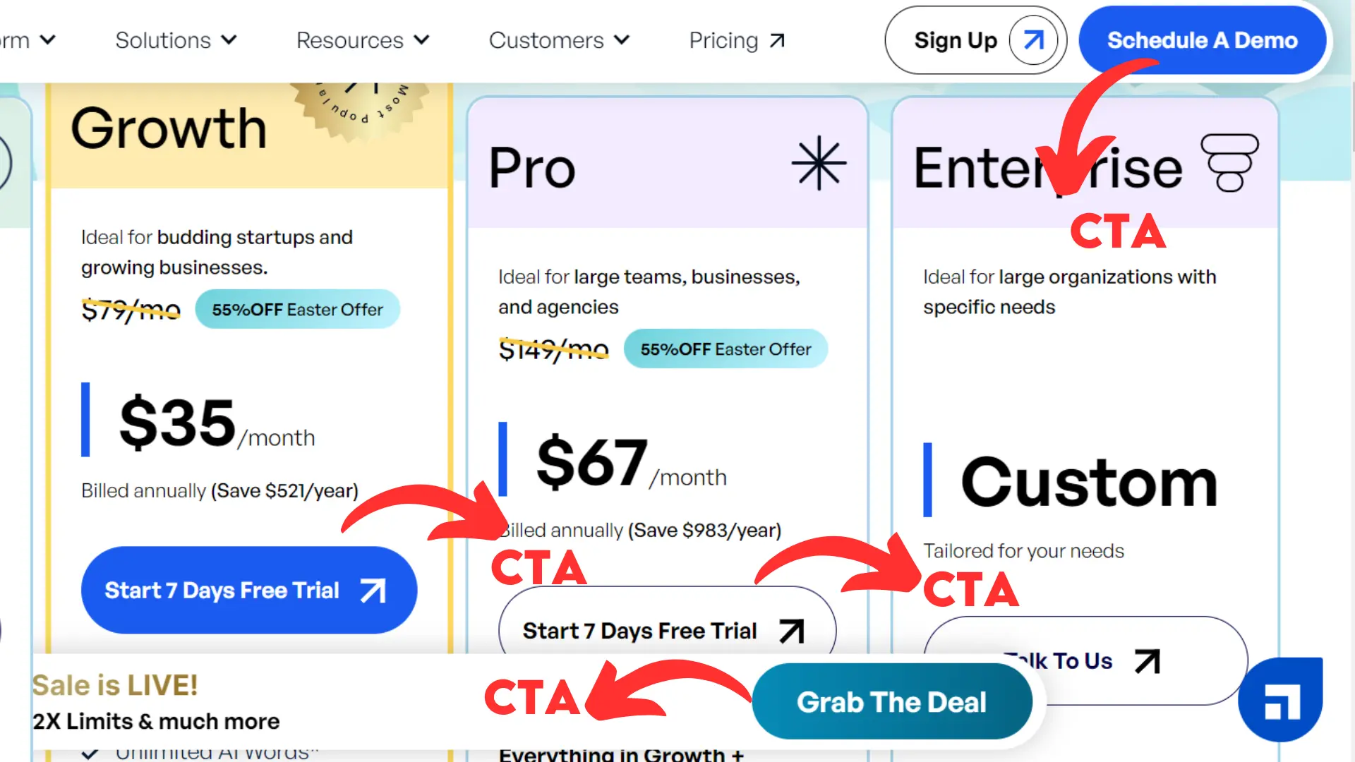
Next, positioning can significantly affect your CTA’s visibility as well. Your visitors’ eyes gravitate to specific sections of your website based on several factors, including page layout, text placement, and overall design flow. Ideally, you want your CTA to be located where visitors’ eyes naturally land. This could include the top of a page, between engaging pieces of content, or as a sticky element that follows them as they scroll.
Do not limit yourself to just one call to action per page. Instead, aim to strategically place multiple CTAs on a single page to bolster the chances of your target audience engaging with them. However, as with everything, moderation is key. Avoid cluttering your site with CTAs, but aim to include significant, attention-grabbing prompts.
Strategies for Higher Conversion Rates
Understanding the audience is the first step toward achieving higher conversion rates. It’s crucial to know who you’re targeting, what they need, and how your product or service can fulfill that need. Information about consumer behavior, such as buying habits, preferences, and motivations, is required. By gleaning these insights, you are better equipped to design CTAs that appeal directly to your target audience’s desires and needs.
Personalization can significantly increase conversion rates. Tailoring your CTAs to the user’s preferences, behavior, or past interactions can make them more relevant and enticing. For example, you could use the user’s name, recommend products based on browsing history, or offer deals pertinent to their location.
Personalized CTAs convert 202% better than default versions.
Testing and optimizing your CTAs is also important. Using A/B to test different proposals of your CTA will make you understand what works best for your audience, such as different phrases, colors, placements, or sizes. With the information of these results, adapt your CTAs for maximum effectiveness. Don’t be afraid to experiment with different CTAs styles and assess their performance to find out what works best for your brand.
Future Trends: Keeping Your Call to Action Relevant in the Changing Digital Landscape
One emerging trend is the rise of the ‘social sharing’ CTA. This form of CTA encourages visitors to share items of interest with their followers on social media platforms. “Share this now” or “Tell your friends” prompt users to become evangelists for your brand, spreading awareness and potentially creating new leads.

Adding CTAs to your Facebook page can increase click-through rate by 285%.
Another growing trend is the use of ‘Learn more’ or ‘Find out more’ CTAs. These action prompts are particularly effective if you provide detailed information, a blog post, or nuanced product descriptions. By inviting users to delve deeper, you offer value and foster engagement with your audience.
For those individuals in the final stages of the purchasing funnel, ‘Free Demo’ or ‘Free Trial’ CTAs can be the deal clincher. This no-risk proposition gives users a taste of what they stand to gain, pushing them to finalize their decision to purchase.
Practical Examples: Successful Call to Action from Top Brands
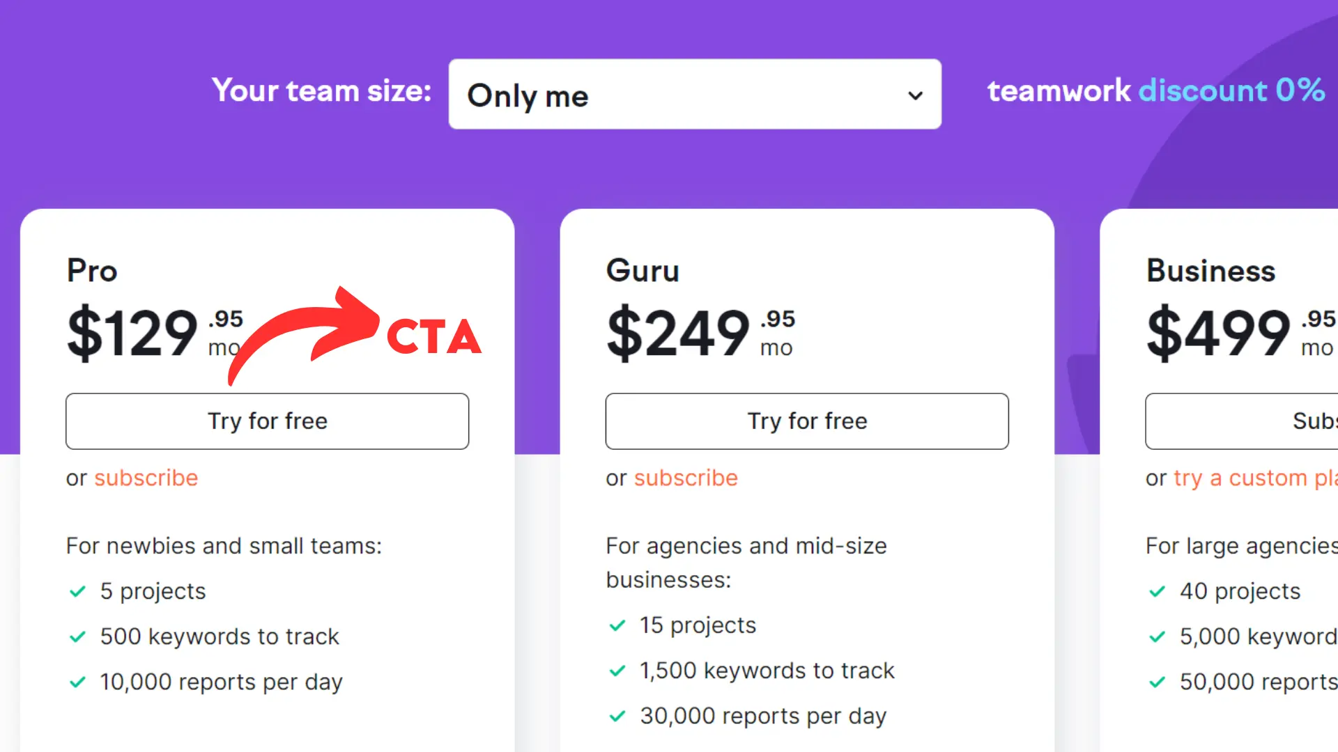
First, let’s consider the quintessential example of a compelling CTA brought to us by SemRush. This giant uses a simple yet powerful ‘Try for free’ button. It takes advantage of two potent tactics – on the one hand, it pushes the users to get started, and on the other, it highlights the zero-risk involved thanks to the free trial.
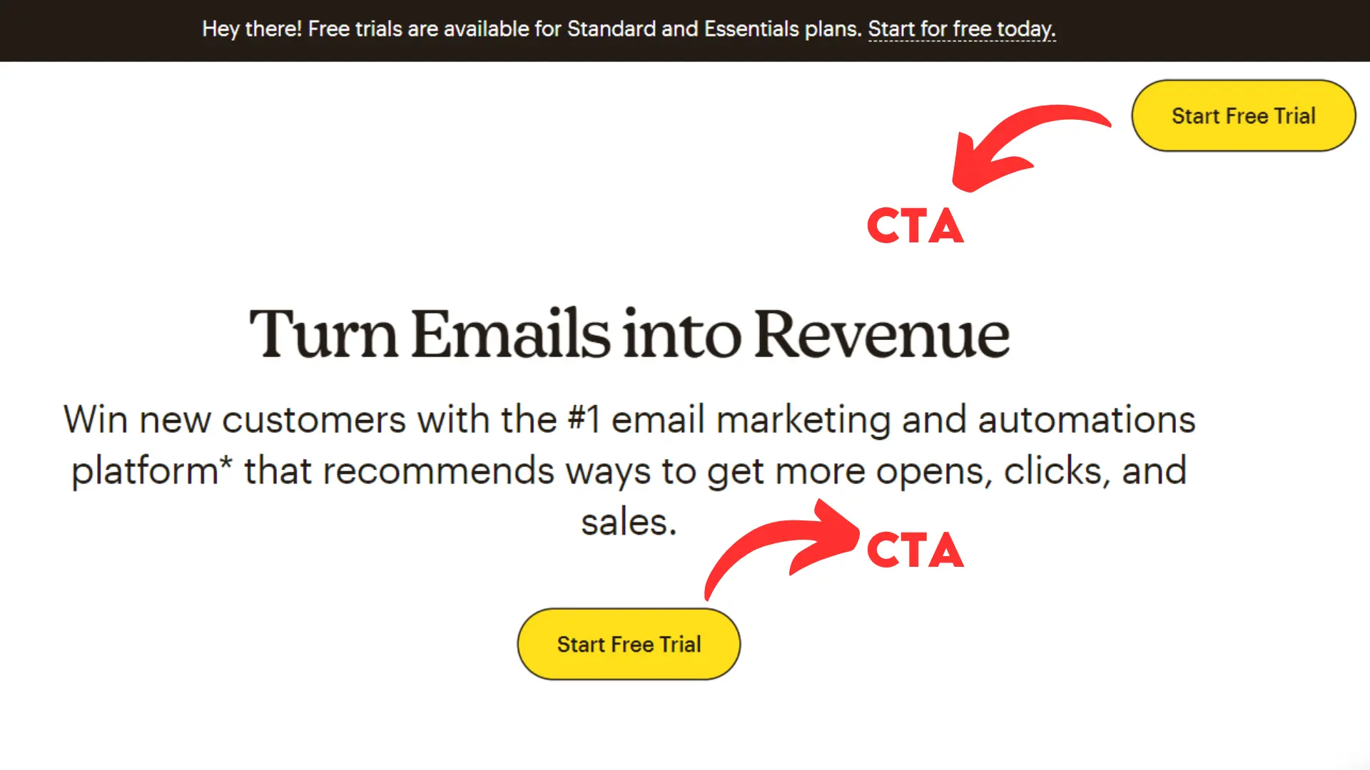
Secondly, MailChimp brings us a finely crafted CTA. ‘Start free trial’ invites the potential user to engage without any monetary commitment, and the term ‘start’ generates the impression of starting a journey, making it a more compelling proposition.
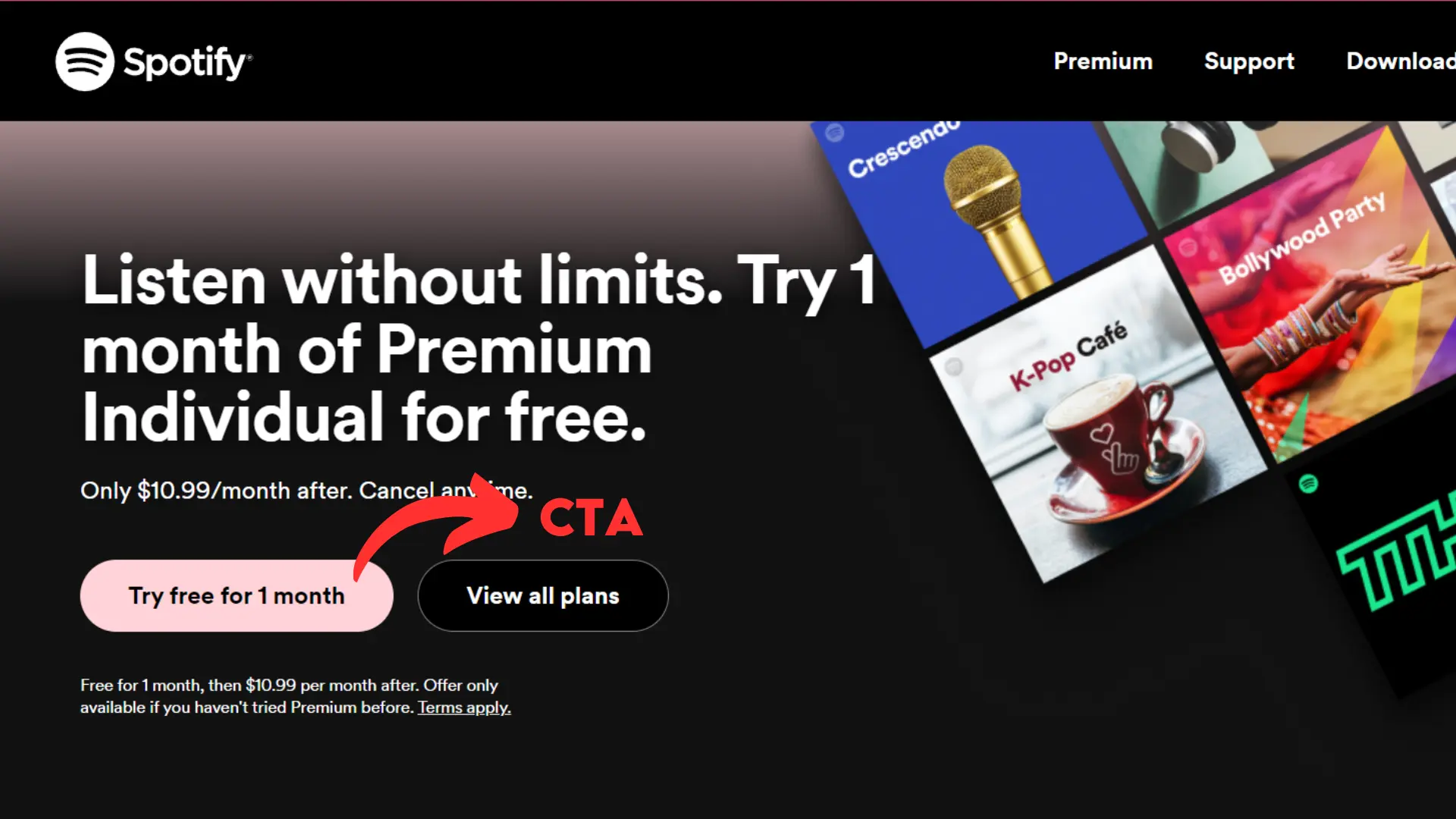
Finally, Spotify‘s CTA is ‘Try one month for Free’. Here, Spotify expertly braced the use of time by defining the one-month trial length, which implies a sense of gain for the user, with ‘Free’ emphasizing the no-cost nature of the deal. Together, these command attention, engagement, and conversions.
Conclusion: Elevate Your Marketing Strategy with Killer Calls to Action that Get Results
Keep in mind that a good Call to Action (CTA) is essential to converting engagement into action. An effective CTA encompasses every aspect of the message, from its clarity to the sense of urgency it generates. To create a compelling CTA, it’s essential to use data-driven insights to optimize it continuously. It helps you find the most resonant message, enticing design, and impactful placement.
However, beyond the data and metrics lies the importance of the CTA—the capacity to connect with your audience on a deeper level, inspire action, and build meaningful relationships. To achieve this, you need to understand the nuances of human behaviour, tap into emotions, and create narratives that inspire instead of force.
Never forget that behind every click, conversion, and success lies a story waiting to be told. It’s a story of connection, empowerment, and transformation. Through the mastery of the CTA, we have the power to shape that story, one compelling call to action at a time—so make every word count!
